Table of Contents
This page is meant to show some ideas for a new gui for Tracks that could be part of Tracks 3.0.
**I think it is very important to keep Tracks recognizable for long-time users. So nothing too radical here. This page is meant to get feedback, it is not an overview of an already settled redesign **
Note: the screenshots are taken from the experimental new-gui branch found in the Tracks repo.
background
The current gui is quite old and has a lot of complex code running it. Adding new functionality is quite difficult and error-prone, even though we have extensive tests.
Rendering times are awful, both on the server (controller / view) and on the client (dom rendering, js). We probably have a lot of dead js-code and unused css-styles
Furthermore, the look of Tracks is getting dated
goals
I see the following goals for a new gui
- Simplify the pages. Currently there is too much going on
- Ease maintenance by using well maintained frameworks. I like jQuery, Bootcamp and Font Awesome for this
- depend on their browser support. We should not try to support browser versions that are not supported by these frameworks
- Reduce page load time using the new caching functionality of rails 4 and some tricks as mentioned here: http://37signals.com/svn/posts/3112-how-basecamp-next-got-to-be-so-damn-fast-without-using-much-client-side-ui
- Make the default pages usable on modern tables / phones. We could keep the current mobile version and try to make the non-mobile version useable on ipad/iphone like devices, so supporting touch is a must-have
- include keyboard shortcuts like google reader had, gmail has, etc.
Overall look-and-feel
Changes
- Move to Bootcamp
- Remove form for new-todo and replace with
- Button in menubar to open new-todo form
- 'a' shotcut to use keyboard to quickly open new-todo form
- use one form to add single todo, multiple todos and repeating todos
- Remove list with project/contexts from sidebar
- Button in menubar to go to project / context
- keyboard shotcuts to quickly go to a project / context. For example use 'g c' to go to a context. This shows a dialog where you can type the context name with autocomplete functionality
- Show less information of a todo by default. Clicking the todo expands it and shows more detail and buttons with actions to do with the selected todo.
- De-emphasize the project and context container on a page. It about the todo
Screenshots
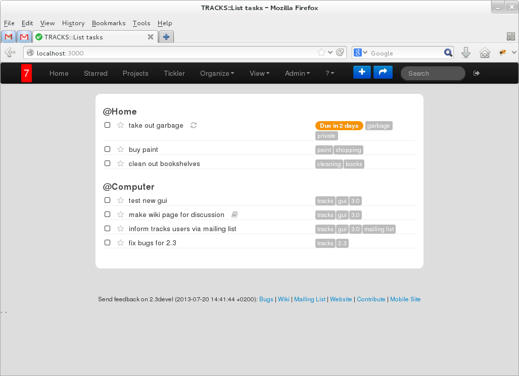
The following screenshot shows the homepage with much less stuff going on
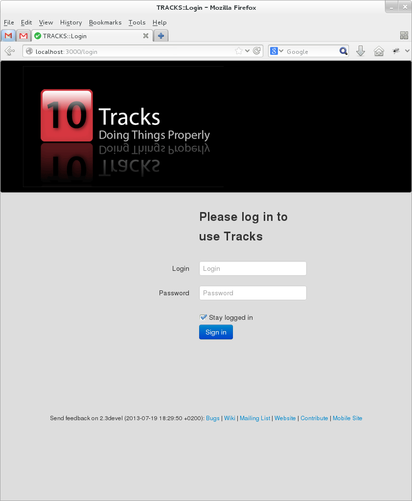
New login screen:
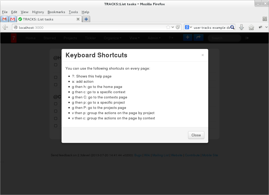
Hitting '?' shows help:
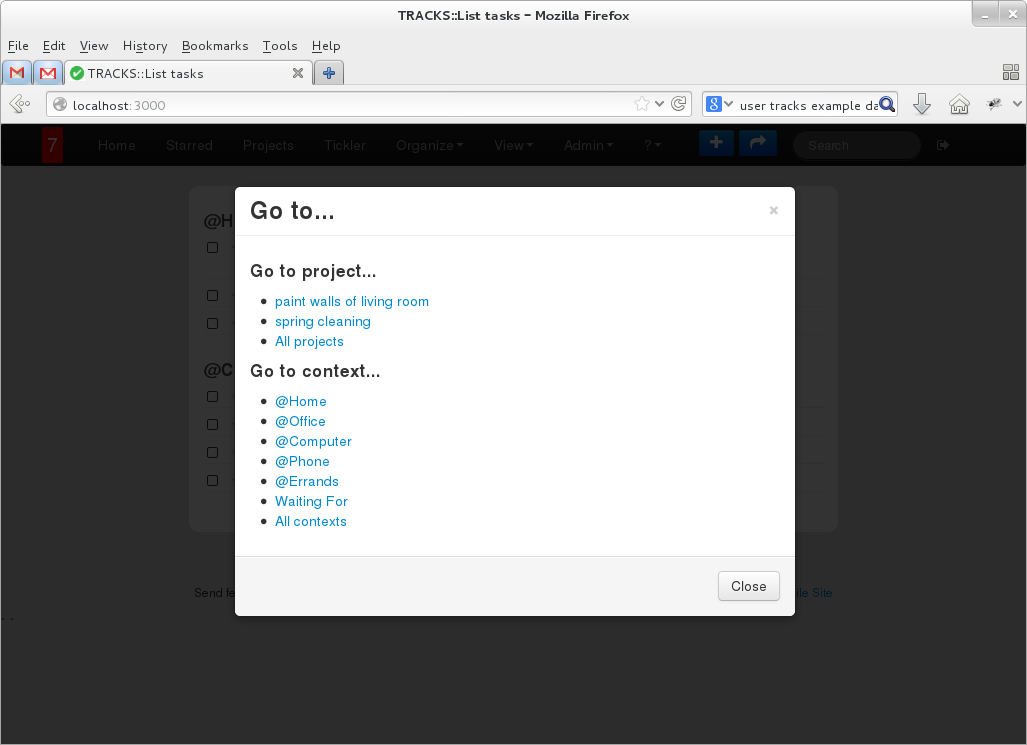
The go to button in the menubar (or hitting 'G') shows a dialog containing the lists of the old sidebar:
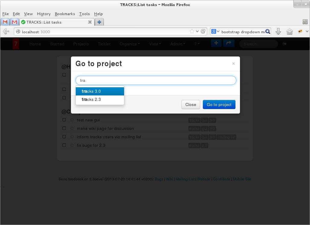
Hitting 'g c' or 'g p' shows a dialog to go to a specific context/project where you can use autocomplete to partially type the name of the project or context:
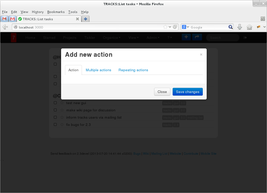
Hitting 'a' or clicking the button in the menubar shows the dialog for adding a (repeating) todo:
The form itself is currently missing, but the dialog should give you an idea...
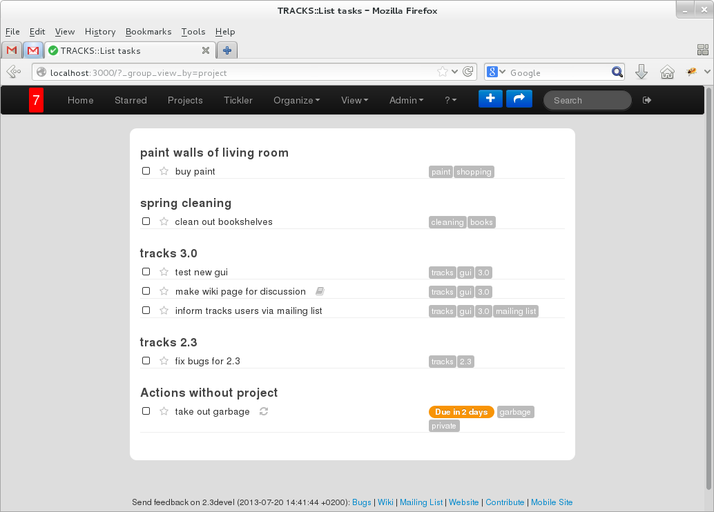
The list of todos shows less information. It can be grouped by context or project.
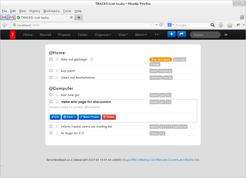
A todo is clickable and will show more information and the action buttons. You can use 'j' and 'k' to select next / previous todo.
To reduce load time, the details are rendered on the client on demand:
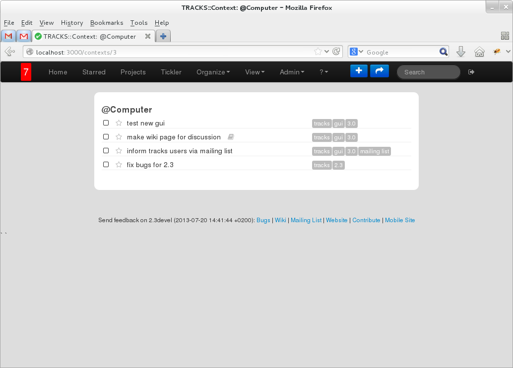
The project, context, tag view are all looking the same and is re-using the same code
Todo
- introduce drag-and-drop to order todos within context / project on all pages
- redo the page listing all projects
- redo the page listing all contexts
Other ideas?
I'm playing around with some ideas in my own sandbox. --dnrce
